

A Saúde Univates, sob a Fundação Fuvates, é uma entidade de ensino comunitária e beneficente de direito privado e sem fins lucrativos que abrange o Laboratório Univates, várias especialidades médicas, odontologia, fisioterapia, nutrição, psicologia, Unidades de Pronto Atendimento (UPA) e Atenção Primária à Saúde (APS). O Estúdio Nub foi contratado para reformular a arquitetura de marca, redefinir o posicionamento e a identidade visual do Saúde Univates e Laboratório Univates.
EN
-
Saúde Univates, under the Fuvates Foundation, is a community and charitable teaching entity governed by private and non-profit law that covers the Univates Laboratory, various medical specialties, dentistry, physiotherapy, nutrition, psychology, Emergency Care Units (UPA) and Primary Health Care (PHC). Estúdio Nub was hired to reformulate the brand architecture, redefine the positioning and visual identity of Saúde Univates and Laboratório Univates.

Desafio & Solução do projeto
O primeiro desafio para o novo posicionamento e identidade visual estava em levar em consideração todas as marcas que orbitam o universo da Fundação, além das próprias marcas que se relacionam diretamente com o Saúde Univates e que também participavam do rebranding, como o Laboratório Univates.
Iniciamos nossa solução com um estudo estratégico para compreender a visão ampliada da saúde e os valores essenciais do instituição e suas submarcas. Realizamos entrevistas, dinâmicas e visitas para identificar a personalidade da marca e desenvolver um guia de linguagem que orientasse como a marca seria reconhecida. O manifesto foi elaborado para reafirmar o novo posicionamento e conectar-se com todas as partes interessadas, internas e externas.
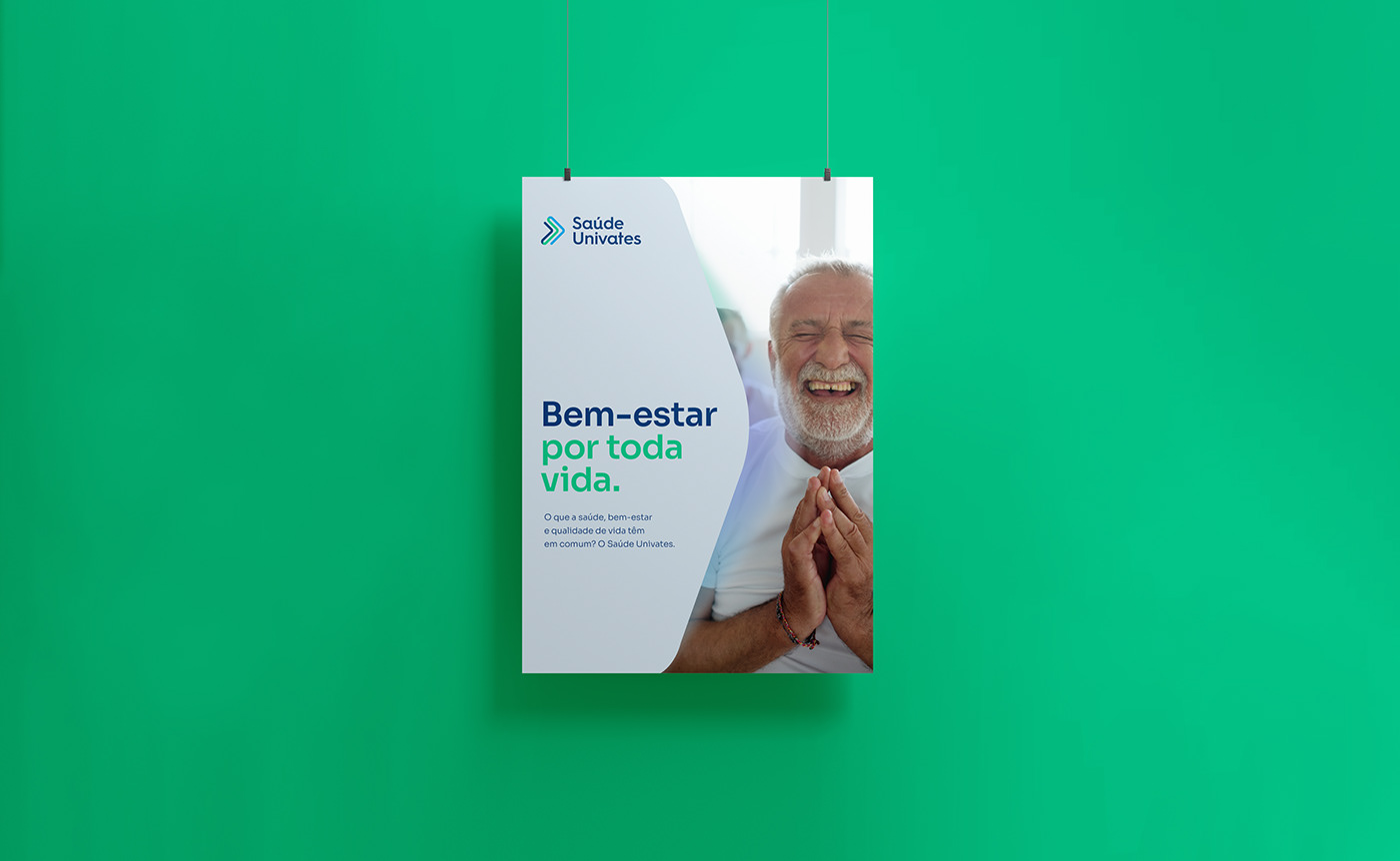
A linha gráfica foi escolhida para transmitir leveza, alegria e equilíbrio, refletindo a essência da marca. O símbolo da Fuvates, com suas setas contínuas em forma de triângulos, inspirou a marca do Saúde Univates, representando o avanço na área da saúde e a conexão com sua mantenedora. Essas setas conectadas simbolizam também o envolvimento das diversas equipes da entidade, unidas pelo esforço contínuo em busca do mesmo propósito focado na visão ampliada da saúde.
EN
-
The first challenge for the new positioning and visual identity was taking into account all the brands that orbit the Foundation's universe, in addition to the brands that are directly related to Saúde Univates and that also participated in the rebranding, such as Laboratório Univates.
We begin our solution with a strategic study to understand the expanded vision of healthcare and the essential values of the institution and its sub-brands. We carried out interviews, dynamics and visits in the facilities to identify the brand's personality and develop a language guide that would orient how the brand would be recognized. The manifesto was created to reaffirm the new positioning and connect with all stakeholders, internal and external.
The visual identity was create to convey lightness, joy and balance, reflecting the essence of the brand and its people. The Fuvates symbol, with its continuous arrows in the shape of triangles, inspired the Saúde Univates brand, representing advancement in the area of healthcare and the connection with its sponsor. These connected arrows also symbolize the involvement of the entity's various teams, united by the continuous effort in search of the same purpose focused on the expanded vision of health.


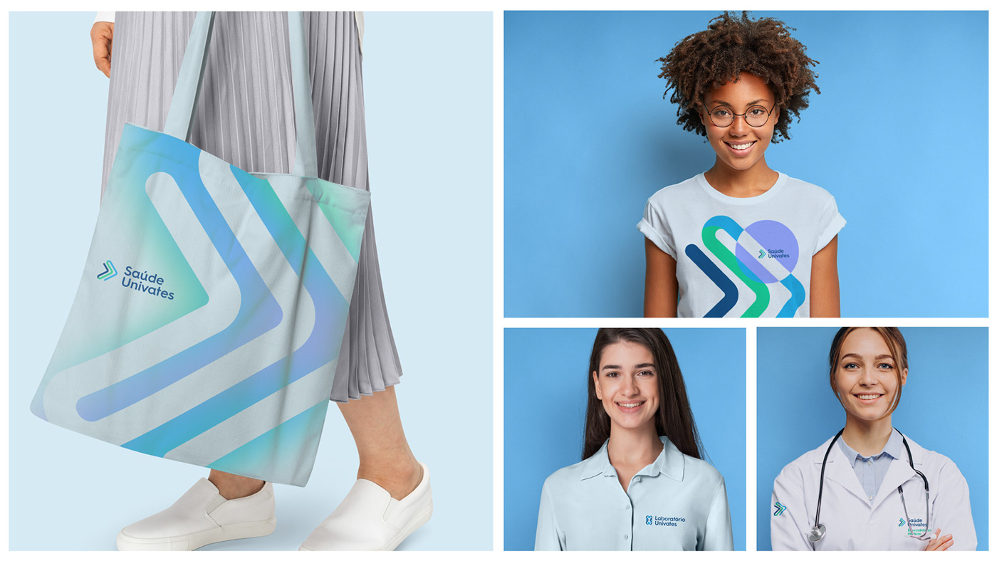

Para a marca do Laboratório de Análises Clínicas, optamos por uma abordagem distinta, embora mantendo elementos similares. As setas entrelaçadas, que podem também ser interpretadas como corações, representam tanto uma fita de DNA quanto as moléculas do corpo humano. Esses elementos estão em consonância com os princípios do Saúde Univates e da Fuvates, criando uma conexão simbólica.
Esse trabalho teve um impacto em todos os pontos de contato da marca, resultando na unidade tão desejada e marcando uma virada significativa que a aproximou de um maior reconhecimento.
EN
-
For the Clinical Analysis Laboratory brand, we opted for a distinct approach, while maintaining similar elements. The intertwined arrows, which can also be interpreted as hearts, represent both a strand of DNA and the molecules of the human body. These elements are in line with the principles of Saúde Univates and Fuvates, creating a symbolic connection.
This work had an impact on all of the brand's touchpoints, resulting in the much-desired unity and marking a significant turning point that brought it closer to greater recognition.


